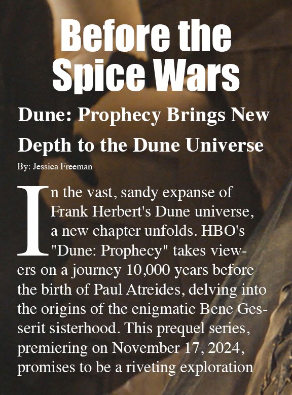
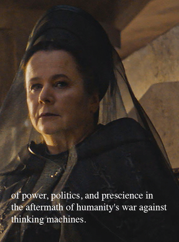
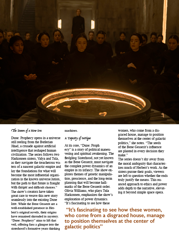
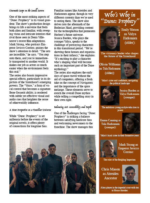
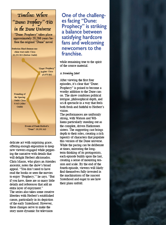
For my graphic design class, I created a magazine-style editorial package titled “Before the Spice Wars” based on Dune: Prophecy. I designed the full layout system in Adobe InDesign, from cover to interior spreads, using a structured multi-column grid, high-contrast cinematic imagery, and a typographic hierarchy built for both longform readability and fast scanning.
Alongside the feature article, I designed modular elements like a timeline infographic, character “who’s who” sidebar, and pull-quote callouts to break up dense text and guide the reader through the story. The result is a cohesive, production-ready editorial design.
Transcend: (logo suite + applications)
For Transcend, an expandable suitcase concept, I designed a logo system that balances function and brand personality. I explored symbol-based and type-based directions, tested them across real use cases (like icons, tags, and social headers), and refined the strongest option into a final set with clear spacing and scalability. The final outcome is a logo suite that works from tiny placements to headline applications while still hinting at the idea of “expanding” without being gimmicky.
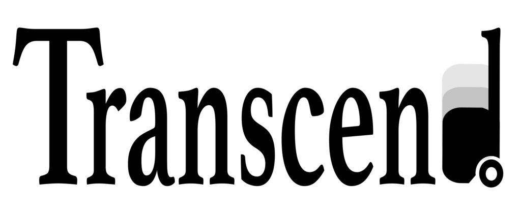
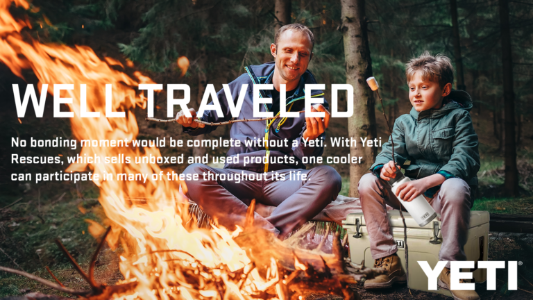
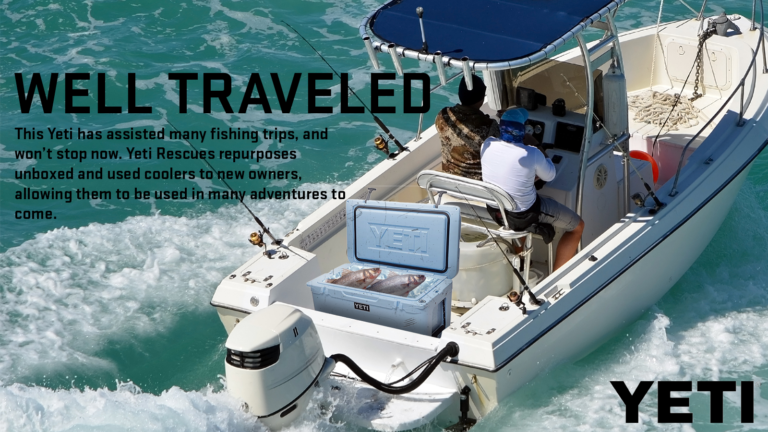
Yeti - Well Traveled Campaign
For my graphic design class, I worked on a campaign project in collaboration with YETI. I developed a “Well Traveled” concept and created a small set of branded graphics exploring how YETI products fit into real travel and outdoor life. The focus was staying true to YETI’s bold, rugged look while making the message clear at a glance through strong typography, clean layout, and high-contrast imagery.
Don’t Be a Little Pitch Social Media Posts
For Don’t Be a Little Pitch, I designed a set of social media posts that balance clarity with personality. The visuals used our bright brand colors to match our playful voice and help the content stand out quickly on Instagram and LinkedIn.
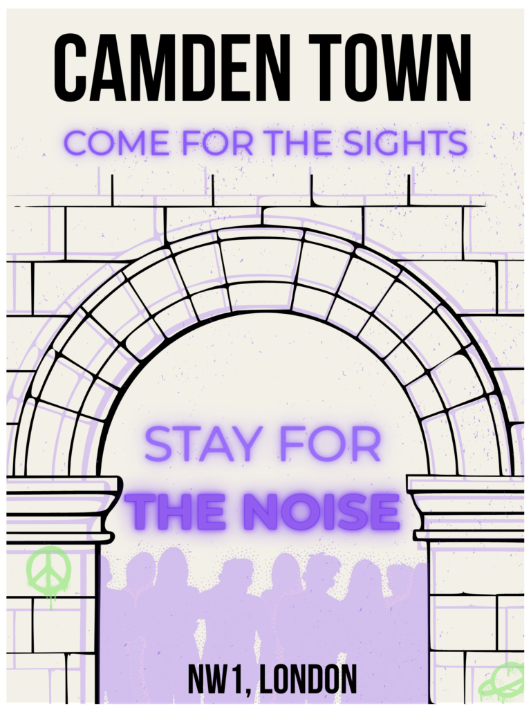
Camden Town Travel Poster
After staying in Camden Town for 5 months, I decided to create a travel poster that sums up the energy I felt there.
I designed a piece that blends gritty street texture with bold, high-contrast typography to capture the neighborhood’s “come for the sights, stay for the noise” energy.
I built the illustration and layout to feel like a modern souvenir, graphic, loud, and slightly chaotic, using a limited color palette, neon-style type, and layered textures to mimic posters, stickers, and graffiti found in the area.
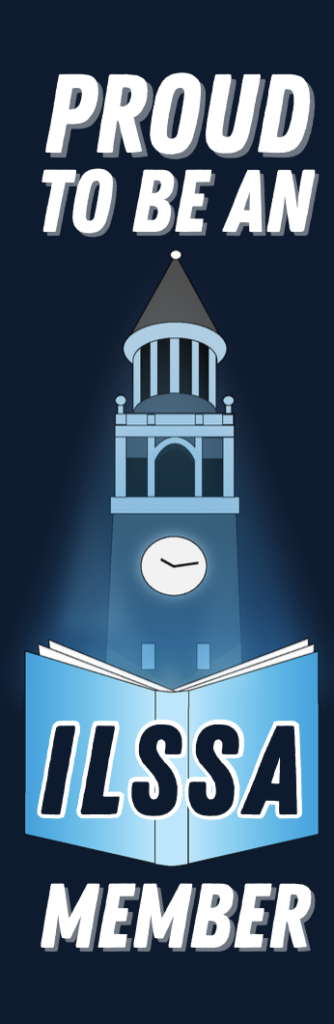
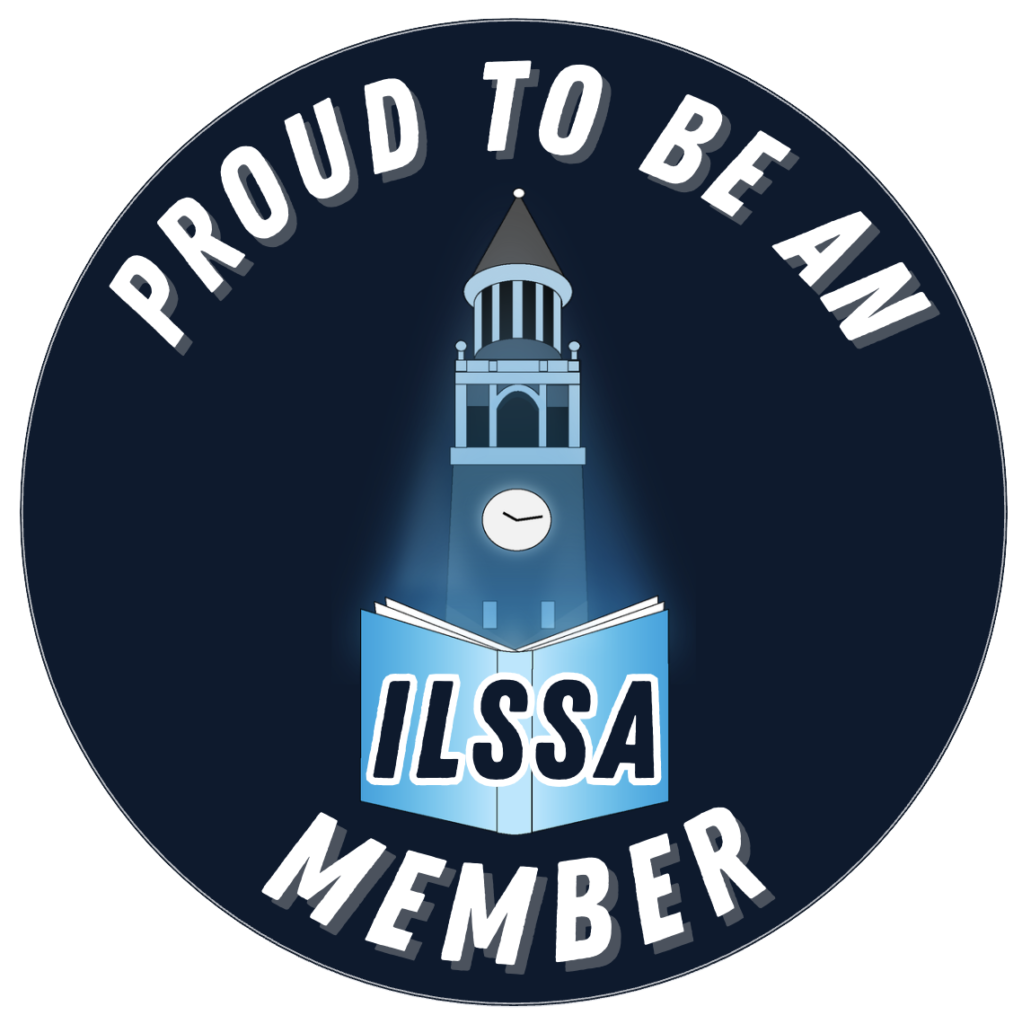
Information and Library Student Society Merch
Buttons and bookmarks designed for UNC’s Information and Library Science Student Society. The blue glow on the Bell Tower nods to the light that shines after a Carolina win, here, it celebrates a “Carolina victory” created through information. I illustrated the Bell Tower in Adobe Illustrator, then adapted the artwork into button and bookmark templates that the E-board can easily edit and reuse in Canva.
LinkedIn Learning Project
As part of the LinkedIn Learning design course, I refined my workflow for building a polished email layout in Photoshop using artboards, grids, and wireframed content blocks. This project focused on typographic hierarchy, scanability, and modular structure for a clean, brand-consistent comp.